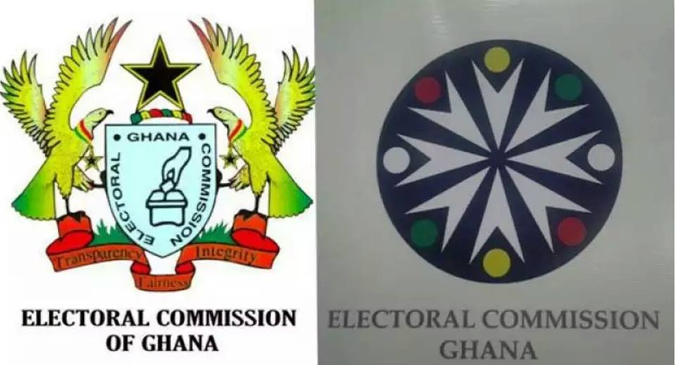
Even before the Electoral Commission, EC officially unveils a new logo already approved for use, journalists have taken on the Commission for its decision to change the logo.
At a capacity building workshop for media practitioners on election reportage on Tuesday, the Electoral Commission displayed a new logo which is to replace the current one.
The new logo, a blue rounded crest with patches of white, yellow, red and green, has been described by some of the journalists as childish and inappropriate.
The critics were of the view the logo does not reflect the work of the commission and that the current one rather communicates better what the commission stands for.
“We have things to put in the logo that evokes Ghana and evokes voting. This does not do it. It looks like some children are holding up some balls, ready to go and play basket ball. That is very nice for an organization that runs children programmes and not for the EC, says blogging Ghana. According to them, “the logo is not right, it can be changed [and] that logo needs to change”.
The current EC logo has a black star in between two eagles at both sides of a shield, with a hand in the middle casting a ballot, which gives one an idea of what the Commission does.
It also has the inscription ‘Transparency, Fairness, Integrity. The new one however has none of these features.
But the Deputy EC Boss in charge of Finance and Administration, Georgina Opoku Amankwaa, said the logo went through an approval process and would be unveiled very soon. The Commission already appears to be using the new logo for its official transactions even before the unveiling.


